

Learn Colour Psychology: How to Select the Perfect Color for Your Brand

Why do some brands feel calm, bold, playful, or premium before you read a single word?
Color often plays a part.
People notice visual cues fast. Your palette can shape a first impression before someone reads your headline, checks your services, or learns your story.
Still, color is not a shortcut to trust. A blue logo does not make a business reliable. A black palette does not make a brand premium.
The real value of brand colour psychology is using color with purpose.
Color works best when it supports the bigger picture. To build a stronger brand, your palette should work with your purpose, message, personality, and customer experience.
Why Brand Colour Psychology Matters
Brand colour psychology looks at how color can shape feelings and expectations. It can help a business choose a palette that supports its personality and message. Color does not control what people think, but it can make the right first impression easier to understand and remember.
People often connect colors with certain ideas.
Blue can feel calm or professional. Green may suggest growth, health, or nature. Red can feel active or urgent. Yellow often feels bright and optimistic.
But those meanings are not fixed.
Culture, industry, context, and personal taste all change how color is read. The same shade can feel playful in one brand and serious in another.
That is why color associations should be used as a guide, not a formula.
Start with the experience you want to create. Then choose colors that support it.
| Color | Common Association |
| Blue | Trust, calm, professionalism |
| Green | Growth, health, nature |
| Red | Energy, action, urgency |
| Yellow | Optimism, warmth, creativity |
| Black | Confidence, luxury, sophistication |
| Orange | Energy, friendliness, confidence |
Match Your Colors to Your Brand Personality
The best palette reflects the brand you want people to experience. Start with your values, audience, and personality before looking at trends. A color may look attractive on its own, but it should also make sense beside your message, service, and the people you want to reach.

Before choosing a palette, ask a few simple questions.
How should customers feel when they meet our brand?
What do we want to be known for?
Which qualities should the brand communicate?
What would feel wrong for our audience or industry?
A financial firm may lean toward calm blues and clear neutrals. A children’s activity brand may use brighter tones. A luxury service may choose a more restrained palette.
None of those choices is automatic. The right answer depends on the brand.
A clear brand identity brings color, typography, logo design, imagery, and messaging into one system. Your palette should support that system, not compete with it.
For small business branding, a simple and clear palette is often more useful than a complex one. It is easier to use well and easier for customers to learn.
Build a Simple Color Palette
A practical brand palette does not need many colors. Most businesses can work with a small set that covers the main brand color, a supporting color, useful neutrals, and one accent. Fewer choices make it easier to create a clear and repeatable visual system.
A simple palette can include:
| Role | How It Is Used |
| Primary color | The main color people connect with the brand |
| Secondary color | A supporting color for variety and balance |
| Neutral colors | Backgrounds, text, space, and structure |
| Accent color | Buttons, highlights, or small points of focus |
You do not need to use every color in every design.
Think about hierarchy instead.
Which color should lead? Which colors should support? Which one should only appear when you need attention?
That makes the palette easier to control.
It also helps the brand feel more intentional.
Keep Your Brand Colors Consistent
Color becomes more useful when people see it in a steady way. Use the same core palette across your website, social content, email, print, and other brand materials. Repetition helps customers connect those visual cues with your business over time.
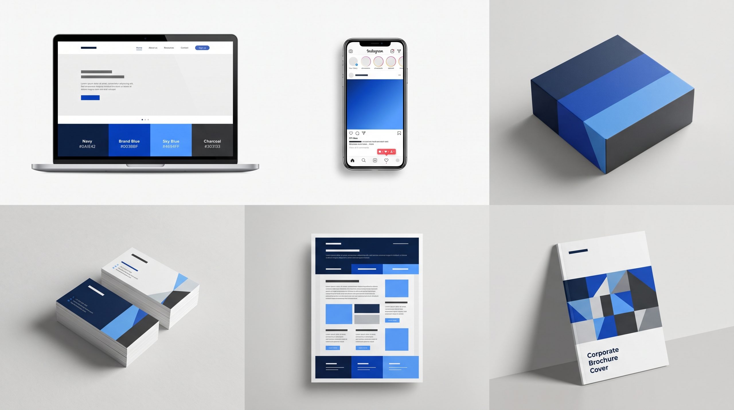 Consistency does not mean every design needs the same layout.
It means the same visual system should still be easy to spot.
Use the correct color codes. Keep the same role for each color. Give your team clear files and templates.
A consistent brand should feel familiar wherever customers find it. The layout may change, but the visual cues should still point back to the same business.
This matters on your website too.
Your website design is often where your full palette has to work hardest. Colors need to support readability, navigation, calls to action, and the overall brand feel.
If a color looks good but makes text hard to read, it is not doing its job.
Good branding should be recognizable and usable.
Do Not Choose Colors Based on Trends Alone
Trends can give you ideas, but they should not decide your brand palette. A popular color may look current now and feel dated later. Choose colors that fit your brand first. Then use trends in smaller ways that are easier to update.
It is easy to save a trendy palette and want the same look for your own brand.
The problem is that your competitors may be doing the same thing.
If everyone in your category follows one visual trend, it becomes harder to stand out.
Use trends for inspiration, not direction.
Your main palette should still make sense when the trend passes.
That gives you more room to evolve without rebuilding the visual identity every year.
BSD Perspective
At Brightsand Designs, we see color as one part of a larger brand system. A good palette should support the message, make key actions easier to see, and stay useful across different formats. The goal is not to choose the prettiest colors. It is to choose the right ones.
A strong palette makes design decisions easier.
Your team knows what to use. Your materials feel more connected. Customers see the same visual cues again and again.
Color can help a brand feel more recognizable.
But it works best when the rest of the identity supports the same idea.
Choose Colors That Make the Brand Clearer
The right brand colors should make your identity easier to understand, not more complicated. Start with your personality and audience. Use color associations as a guide. Build a simple palette. Then apply it with enough consistency for people to learn and recognize it.
There is no perfect color for every business.
There is only a palette that makes sense for yours.
Choose it with purpose.
Use it with care.
Then let repetition do the rest.

Related Posts

How To Keep Your Brand Consistent And Why You Need To
Brand consistency helps customers recognize and trust your business. Learn how…


How to Build a Brand, Not Just a Business
Learn how to build a brand that earns trust, creates recognition, and supports…

Exploring the Top 10 Fastest Growing Real Estate Markets in the United States
Join us on a journey through the top 10 fast-growing real estate markets, where…
