
How to Select the Perfect Color for Your Brand
Learn Colour Psychology: How to Select the Perfect Color for Your Brand
Why do some brands feel calm, bold, playful, or premium before you read a single word?
Color often plays a part.
People notice visual cues fast. Your palette can shape a first impression before someone reads your headline, checks your services, or learns your story.
Still, color is not a shortcut to trust. A blue logo does not make a business reliable. A black palette does not make a brand premium.
The real value of brand colour psychology is using color with purpose.
Color works best when it supports the bigger picture. To build a stronger brand, your palette should work with your purpose, message, personality, and customer experience.
Why Brand Colour Psychology Matters
Brand colour psychology looks at how color can shape feelings and expectations. It can help a business choose a palette that supports its personality and message. Color does not control what people think, but it can make the right first impression easier to understand and remember.
People often connect colors with certain ideas.
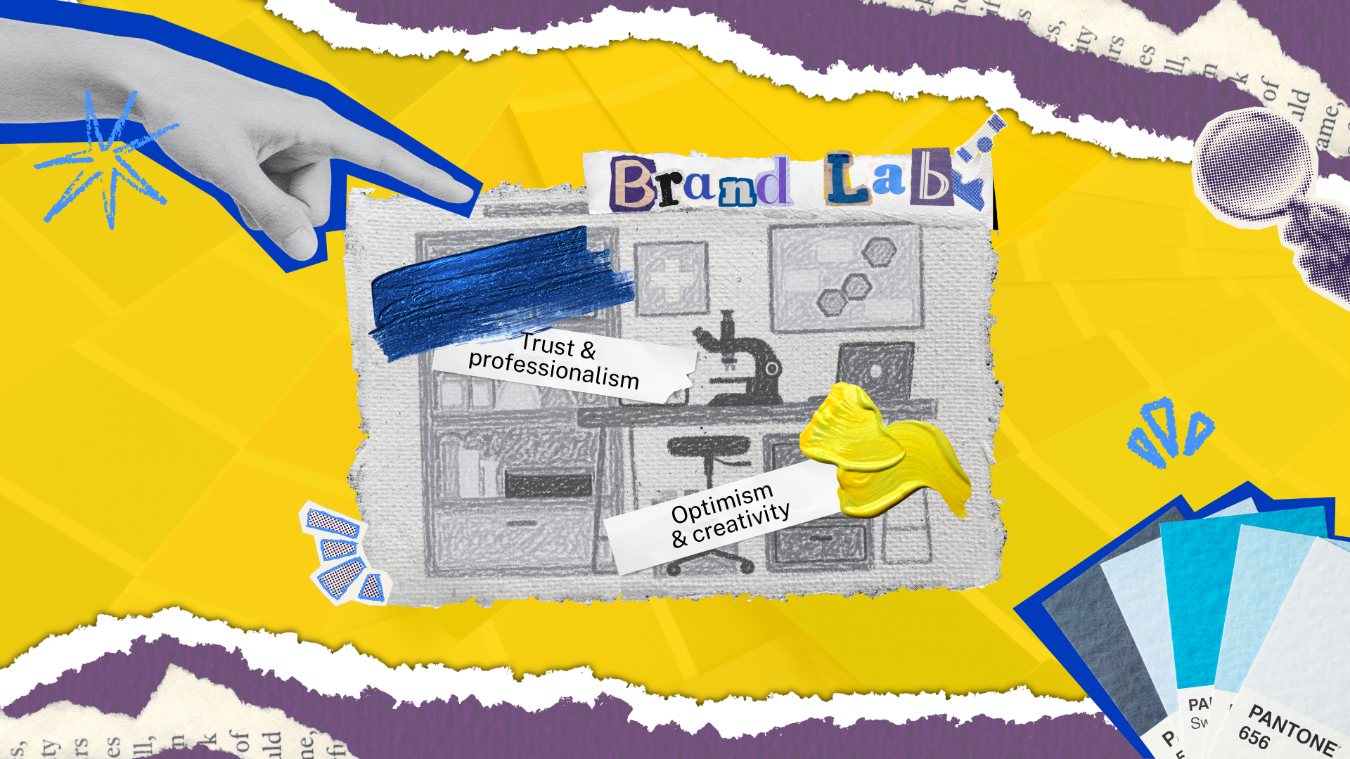
Blue can feel calm or professional. Green may suggest growth, health, or nature. Red can feel active or urgent. Yellow often feels bright and optimistic.
But those meanings are not fixed.
Culture, industry, context, and personal taste all change how color is read. The same shade can feel playful in one brand and serious in another.
That is why color associations should be used as a guide, not a formula.
Start with the experience you want to create. Then choose colors that support it.
| Color | Common Association |
| Blue | Trust, calm, professionalism |
| Green | Growth, health, nature |
| Red | Energy, action, urgency |
| Yellow | Optimism, warmth, creativity |
| Black | Confidence, luxury, sophistication |
| Orange | Energy, friendliness, confidence |
Match Your Colors to Your Brand Personality
The best palette reflects the brand you want people to experience. Start with your values, audience, and personality before looking at trends. A color may look attractive on its own, but it should also make sense beside your message, service, and the people you want to reach.

Before choosing a palette, ask a few simple questions.
How should customers feel when they meet our brand?
What do we want to be known for?
Which qualities should the brand communicate?
What would feel wrong for our audience or industry?
A financial firm may lean toward calm blues and clear neutrals. A children's activity brand may use brighter tones. A luxury service may choose a more restrained palette.
None of those choices is automatic. The right answer depends on the brand.
A clear brand identity brings color, typography, logo design, imagery, and messaging into one system. Your palette should support that system, not compete with it.
For small business branding, a simple and clear palette is often more useful than a complex one. It is easier to use well and easier for customers to learn.
Build a Simple Color Palette
A practical brand palette does not need many colors. Most businesses can work with a small set that covers the main brand color, a supporting color, useful neutrals, and one accent. Fewer choices make it easier to create a clear and repeatable visual system.
A simple palette can include:
| Role | How It Is Used |
| Primary color | The main color people connect with the brand |
| Secondary color | A supporting color for variety and balance |
| Neutral colors | Backgrounds, text, space, and structure |
| Accent color | Buttons, highlights, or small points of focus |
You do not need to use every color in every design.
Think about hierarchy instead.
Which color should lead? Which colors should support? Which one should only appear when you need attention?
That makes the palette easier to control.
It also helps the brand feel more intentional.
Keep Your Brand Colors Consistent
Color becomes more useful when people see it in a steady way. Use the same core palette across your website, social content, email, print, and other brand materials. Repetition helps customers connect those visual cues with your business over time.
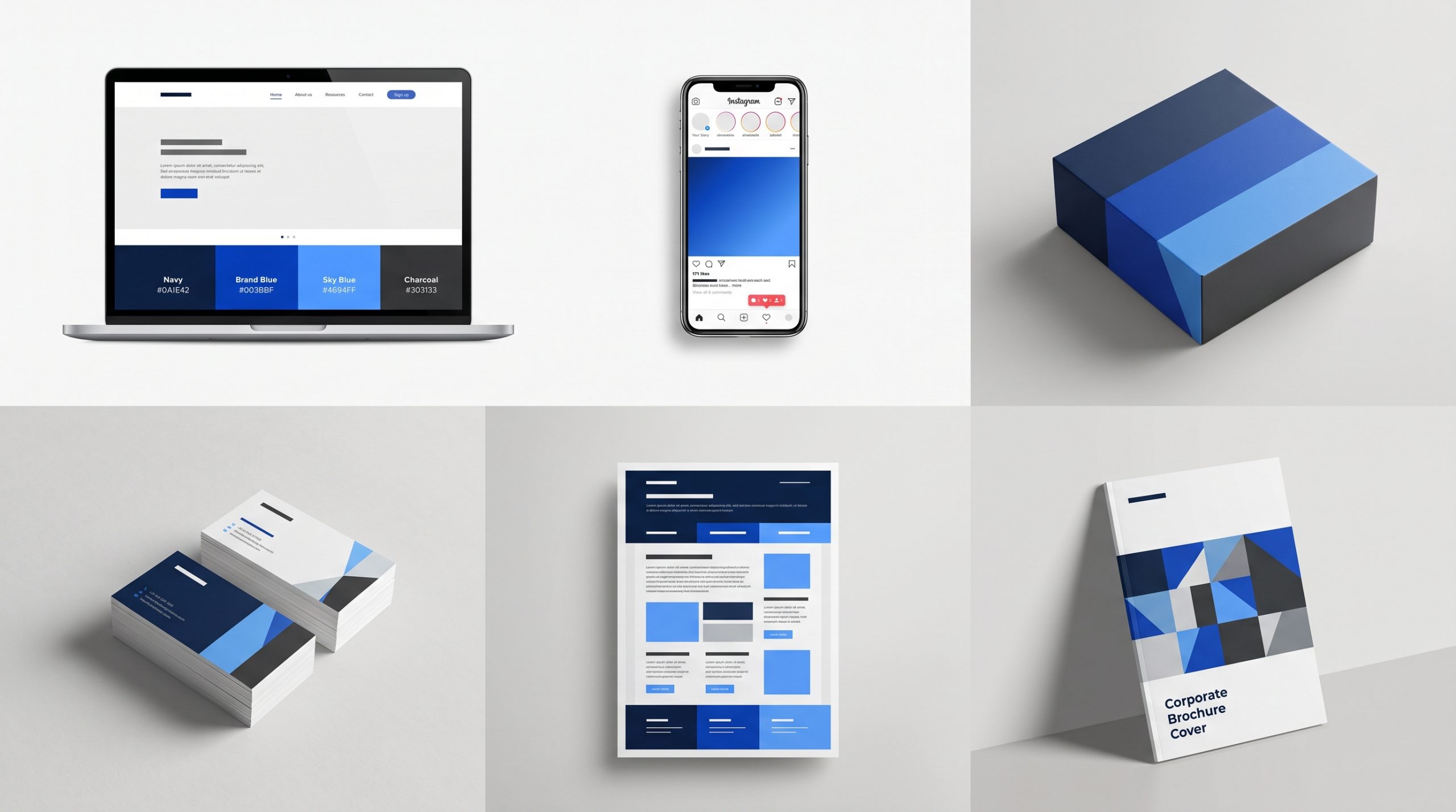 Consistency does not mean every design needs the same layout.
It means the same visual system should still be easy to spot.
Use the correct color codes. Keep the same role for each color. Give your team clear files and templates.
A consistent brand should feel familiar wherever customers find it. The layout may change, but the visual cues should still point back to the same business.
This matters on your website too.
Your website design is often where your full palette has to work hardest. Colors need to support readability, navigation, calls to action, and the overall brand feel.
If a color looks good but makes text hard to read, it is not doing its job.
Good branding should be recognizable and usable.
Do Not Choose Colors Based on Trends Alone
Trends can give you ideas, but they should not decide your brand palette. A popular color may look current now and feel dated later. Choose colors that fit your brand first. Then use trends in smaller ways that are easier to update.
It is easy to save a trendy palette and want the same look for your own brand.
The problem is that your competitors may be doing the same thing.
If everyone in your category follows one visual trend, it becomes harder to stand out.
Use trends for inspiration, not direction.
Your main palette should still make sense when the trend passes.
That gives you more room to evolve without rebuilding the visual identity every year.
BSD Perspective
At Brightsand Designs, we see color as one part of a larger brand system. A good palette should support the message, make key actions easier to see, and stay useful across different formats. The goal is not to choose the prettiest colors. It is to choose the right ones.
A strong palette makes design decisions easier.
Your team knows what to use. Your materials feel more connected. Customers see the same visual cues again and again.
Color can help a brand feel more recognizable.
But it works best when the rest of the identity supports the same idea.
Choose Colors That Make the Brand Clearer
The right brand colors should make your identity easier to understand, not more complicated. Start with your personality and audience. Use color associations as a guide. Build a simple palette. Then apply it with enough consistency for people to learn and recognize it.
There is no perfect color for every business.
There is only a palette that makes sense for yours.
Choose it with purpose.
Use it with care.
Then let repetition do the rest.

10 Creative Website Design Ideas For Small Businesses In 2020
Small businesses need to stand out. Getting started in any niche is hard when there are already more prominent players; that's why having a website that distinguishes you from the rest is vital. Let's face it, everyone has a website, from your local mom n' pop shop to your mini-influencer.
It's your digital real estate on the internet to help you connect and reach new clients. A website is a cost-efficient marketing tool that focuses on YOU and the content you want to focus on. It will also help people get to know your brand better without you having to exert much effort.
If you don't have a website yet or want to start one, we want to share 10 Creative Website Design Ideas For Small Businesses In 2020. You don't need anything too fancy to get started. It would help if you had a little push in the right direction.
MAKE IT FUN
Would you go through a website full of text and slideshow photos or a creative and engaging page that entertains and informs? Audiences love consuming content quickly while being presented with your product and information. Information from SEMRush suggests that website users' attention span last only eight (8) seconds.
Within that period, users can get distracted or click off for several reasons, such as it takes too long for the website to load or it might be hard to navigate. By engaging your audience efficiently with fun illustrations or designs, you can hold their attention longer, and visiting your website won't seem like such a chore.

MAKE IT MOBILE FRIENDLY
Everyone is on their phone. You might even be reading this from your phone. A website has to be mobile-friendly to increase your reach and to be accessible everywhere. Your website needs to be able to look good on both the PC and mobile.
Google released a statement back in 2015 that they use mobile-friendly sites as a ranking signal. If you're unsure about making your site mobile-friendly, you can continuously tap a design company that can make this step much easier for you.
In a way, this situation is two-pronged. You need to rank first on search results when customers look for your niche, and your potential clients need a website compatible with their mobile devices.
Phones are here to stay, becoming increasingly ingrained in our lives, from contacting loved ones to online shopping. A profitable business knows that this form of marketing is essential.

TELL A STORY
The human brain is programmed to understand stories. One example of a website that knows how to sell its product and tell a story is Bagigia.
They sell bags in a way that showcases their best product, then gives you a history of the designer and makes it fun while you scroll down, having a navigation bar that looks like a zipper.
This is an example of what a website that tells a story looks like. You don't have to say an actual once-upon-a-time account; you only have to structure the content into a story-like format.
This will keep readers engaged, making your content easier to digest. You can find more examples of story-telling websites here. The best one would have to be the one by GoSquared, which tells the story of the Olympic games.
CLEAR COPY
Visitors looking at your website want a solution to their problems. Whatever it may be, they're there to see how you can help them, even if the website's content is all about you and your product. That's why utilizing clear and quality content copy is what you should focus on.
Customers want to know the benefits of how you can help them rather than just only learning about your product or service. It's also important to note that some websites try to fit in as much "below the fold" when they should only include "key" features, which doesn't have to be all.
Yes, we know you've got a unique brand or company with all these fantastic features….but the thing is, not everyone will take the time to read it all. For example, Campos Coffee (no relation to the author of this post ) focuses on their product and how their customer would feel if they bought from them.
Tapping into emotions is a critical factor in keeping your audience's attention. In his book, Designing for Emotion, Aaron Walter wrote about how vital the emotional experience is because they have a unique imprint on your long-term memory and how users want to experience a human, not machine, connection on the other end.
Never underestimate the power of critical features and an emotional connection when writing content for your website.
VIDEO
One of the most underrated techniques for getting onto the first page of Google search rankings is video. Having a video lets you get your message out to prospects faster, and it's easier to "digest" than reading blocks of text. A study by Biteable concluded that 6 out of 10 people would rather watch online videos than television.
You can hire a design team to create a short video with your company's key points. Something fun and creative that catches the eye will increase your site's engagement. 92% of marketers consider this an essential tool.
Think of it as a way for your prospects to understand your company or product better and for you to quickly get your message across. However, as pointed out by Rocketspark, there is a time and place where the video is needed. Make it too long, and people won't click on it. Just like reading, a video requires a certain amount of time commitment.
There are different kinds of videos, like the introductory kind, the customer testimonial, and the instructions. A design company can help you decide what goes best on your website if you're unsure.
FONT
Fonts and their sizes may seem like a no-brainer, but it's one of the essential parts of your website. Your website should balance at least two to three fonts in different sizing so that you can highlight what's important and so your viewers can navigate your pages easily. If everything is the same size and font, your viewer may get lost in blocks of the exact text.
You can distinguish what is essential and content when using varying-sized fonts. Neil Patel does a great job of making an example of a font and a typeface. Yes, there's a difference. An example of a website that uses this technique is the blog itself. However, a designer will be able to tell the difference and can work with you on this.
TYPEFACES
It's important to note that there is a difference between typography and font. The thing about saying 'font' and 'typeface' is that they can be used interchangeably, but if a designer or anyone else asks for specifics, it's good to know the difference. Check out Google Fonts; they have a great selection of typefaces or 'fonts' that you can use for your website.
Your chosen typeface will have a significant impact on your website. It needs to be easy to read and understood by everyone. If you have a particular fondness for a typeface, but it's unreadable to everyone except you, then only you enjoy it. We recommend browsing through Sans Serif. Most notable websites generally use this.
The point of a website is to market yourself, yes. But it has to be about catering to the needs you can fulfill for your customers, and it needs to be understood easily; that can't be done if no one else will have the patience to read through rows and rows of a curvy or too compact typeface.

Now isn't this fun to read through?
COLOR
Did you know that colors can increase your brand recognition by up to 80%? Choosing your website's colors will create consistency and recognition that will immediately have people remembering you.
A lot goes into choosing the right color for your website. Colors are more than just a feature to make your website pop and stand out. They can have an emotional effect and varied meanings depending on culture, personal history, and preferences, and you can't forget to think about those who are colorblind. Everyone has a different way of interpreting the color palette they like.
Now, this seemingly minute detail can immensely impact your brand or business. Forbes has a small list of which colors affect which emotions can go with your brand or logo.
Don't forget color consistency is critical to keeping it clean and pleasing to the eye.
STRUCTURE
An essential part of SEO is knowing how to structure your website to rank in Google's search engines. The structure is pretty self-explanatory too. Like this:

Yoast can teach you website structure if you're having difficulty learning or can't figure out what to do. Another option is to hire a design team to give you some pointers. Put, website structure organizes everything related to your website, business, or product. This way, it'll be easier for Google to scan and manage your website where it should go on search engines.
It isn't all about Google but also the user experience. Think of it like this; you want a site that can be understood for its content and enjoyed because it's easy on the eyes. If your site isn't structured well, users will have difficulty navigating where they want to go and may click off. Luckily, Yoast has more explanations about how and why structure is essential.
WHAT'S NEXT?
BRIGHTSAND designs is a full-service digital marketing agency that intends to help you get started on scaling your business! We have more information in our blog post if you're looking for additional information on whether the website's effectiveness you've just created works. There's a lot to learn now that everything has gone digital, and we can help you with that.

