Visionary Brand Creation
Creating a brand is not just about designing a logo or choosing colors – it's about crafting a compelling narrative that resonates with your audience, differentiates you from competitors, and drives meaningful connections that lead to business growth. Our client, La Provincia, exemplifies our commitment to excellence in brand creation.
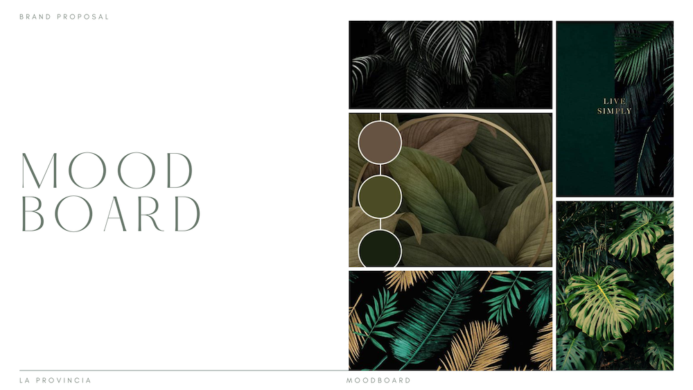
La Provincia embodies the charm and allure of provincial living—a tranquil retreat nestled amidst nature's embrace. Drawing inspiration from the lush greenery, rolling hills, and serene landscapes of the province, we sought to infuse these elements into the brand's visual identity. The color palette, typography, and imagery were carefully curated to reflect the natural beauty and rustic charm of the province, creating a visual language that transports audiences to a world of tranquility and simplicity
Conveying Tranquility
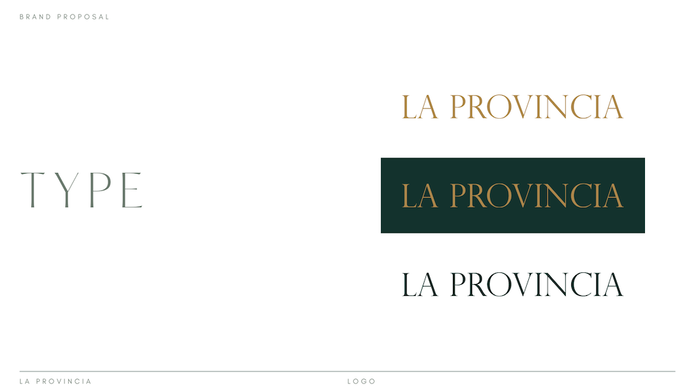
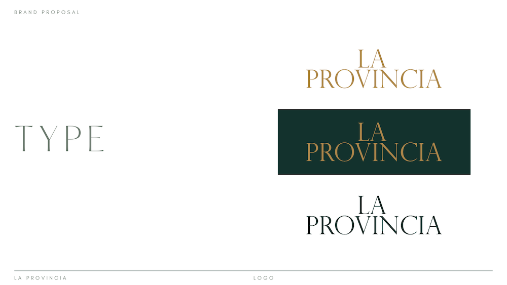
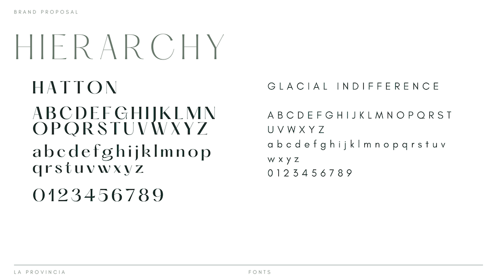
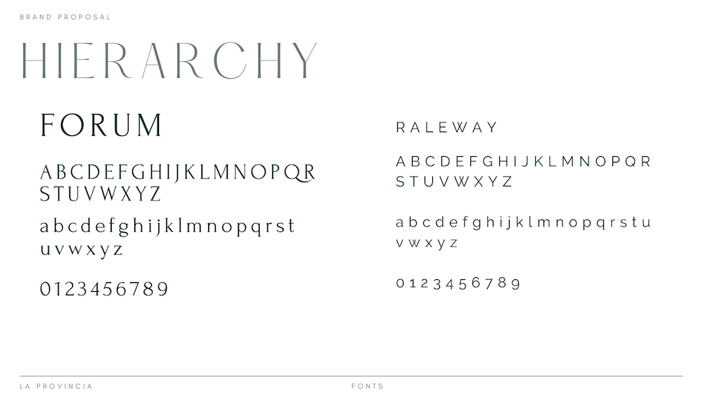
Serenity is at the heart of La Provincia’s brand ethos – a sanctuary where families can unwind, reconnect, and create lasting memories. To capture this essence, we opted for a clean, minimalist aesthetic characterized by soft, muted tones and subtle textures. The use of light, airy fonts and open spaces creates a sense of tranquility and harmony, inviting audiences to immerse themselves in the peaceful ambiance of La Provincia’s surroundings.
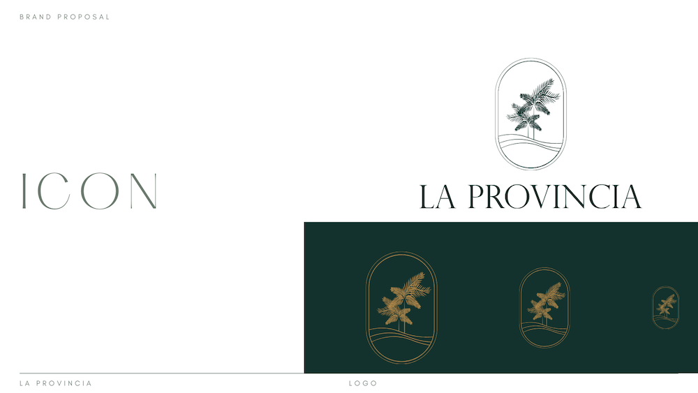
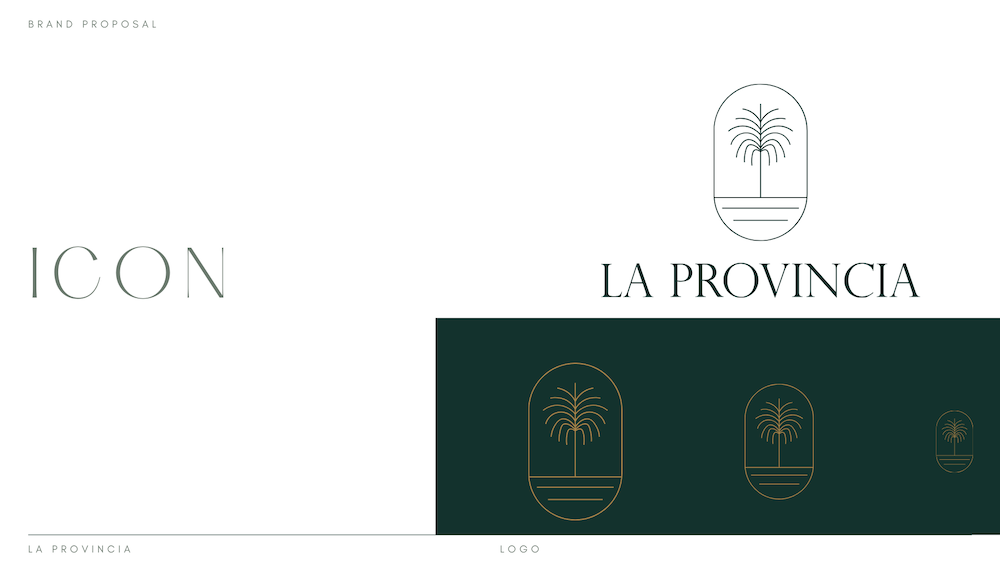
Evoke a Sense of Greenery
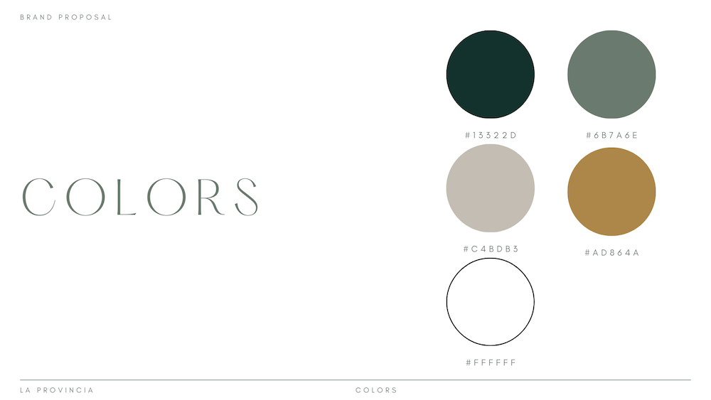
Green is more than just a color – it’s a symbol of growth, vitality, and renewal. In designing La Provincia’s brand identity, we incorporated shades of green to evoke a sense of lush greenery and natural abundance. From the deep, earthy tones of the forests to the vibrant hues of the countryside, green serves as a unifying element that ties the brand to its natural surroundings and reinforces its connection to the land.
As La Provincia’s brand identity continues to resonate with its audience, the impact extends far beyond just aesthetics. By authentically capturing the essence of the province’s rich heritage, natural beauty, and timeless allure, the brand creates a powerful emotional connection with potential buyers. This connection serves as the foundation for building trust, fostering loyalty, and ultimately driving real estate success.
The carefully curated combination of colors, fonts, and logo design elements serves as a visual representation of La Provincia’s commitment to providing a sanctuary for families to thrive and create lasting memories. Each aspect of the brand identity – from the soothing color palette reminiscent of the province’s lush landscapes to the elegant typography that exudes sophistication and warmth – reinforces the brand’s promise of tranquility, serenity, and family.